Unplug Your Mouse - One Year On, Accessibility Widgets Still Don't Work
June 27, 2026
accessibilityweb developmentThe European Accessibility Act turns one tomorrow. It took force on 28 June 2025. For many teams it was the first hard deadline they had ever faced for this work — e-commerce, banking, transport, ticketing, and telecom, across all 27 EU countries.
A year on, the same reflex persists — and it still doesn’t work. A team bolts an accessibility widget into the corner of the page: a floating icon that swears it fixes accessibility in one click. It does not. Here is why, and here is what I do instead.
A widget is a sticker over a crack
Accessibility widgets (often called “overlays”) are plugins installed on websites to add functionality via overlay buttons. They frequently promise compliance with regulations (such as WCAG or EAA) with a single line of code. - www.hintogroup.eu
Most accessibility lives in your markup and your CSS, not in a script you paste before </body>. A widget can recolor text or grow the font. It won’t build a focus order your page never had. It can’t teach a <div onclick> to behave like a <button />.
The Nielsen Norman Group has said this for years: accessibility is a mindset, not a checklist, and a bolted-on widget is not enough. The only real test is to put disabled users in front of the design. So drop the sticker. The best test costs nothing but a little pride.
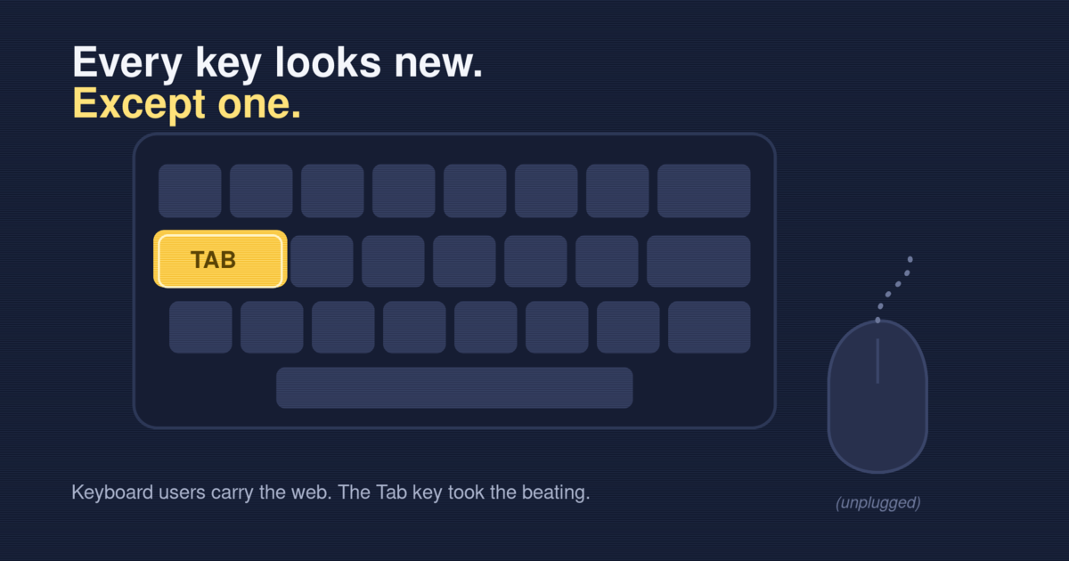
Unplug your mouse
Testing keyboard accessibility starts the same way every time: pull the mouse out. Use your own site with the keyboard. Tab forward, Shift+Tab back, Enter and Space to act, Esc to close.
You will find the broken parts in a minute. A modal you can tab into but never out of. A dropdown the keyboard skips. A “button” that ignores Enter because it is a <span> in costume. The mouse hid all of it.
This is no fringe group. Some people drive the keyboard because their hands need it, some because a screen reader drives it for them, some because it is faster. Marieke McCloskey set the three rules a decade ago, and they still hold: keep focus visible, let the Tab key reach every control, and let users skip past long menus.
This is the check I run as I tab:
flowchart TD
    A[Press Tab] --> B{Can I see where focus landed?}
    B -- No --> F[Fail: focus indicator missing or hidden]
    B -- Yes --> C{Did focus reach every control in a sane order?}
    C -- No --> G[Fail: unreachable or illogical focus order]
    C -- Yes --> D{Can I activate it with Enter or Space?}
    D -- No --> H[Fail: not a real interactive element]
    D -- Yes --> E{Can I get back out? No keyboard trap?}
    E -- No --> I[Fail: keyboard trap]
    E -- Yes --> J[Pass this element]
Three of those boxes catch most of what I find. None need a widget. They need markup.
The dull CSS that does the work
WCAG 2.2 shipped on 5 October 2023 and added nine new criteria. Most are boring — deliberately. They turn good intentions into numbers you can check.
Focus first
This is still the worst line of CSS on the web:
/* Please don't. This blinds every keyboard user. */
:focus {
  outline: none;
}
People strip the ring because it looks untidy on a mouse click. Don’t delete it — show it to the people who need it. The :focus-visible pseudo-class fires only when the browser judges a ring would help, which means keyboard use and not a stray click (MDN).
/* Quiet for mouse clicks, loud for keyboard users. */
:focus-visible {
  outline: 3px solid #1a73e8;
  outline-offset: 2px;
}
Keyboard users get a clear ring. Mouse users see nothing on click. Nobody is stranded. WCAG 2.2 even put numbers on it: Focus Appearance wants a ring large and sharp enough to spot, and Focus Not Obscured bars a sticky header from hiding it.
Now hit targets. Target Size (Minimum) asks for at least 24 by 24 CSS pixels, or enough space that a 24px circle on each does not touch its neighbor. This is for everyone who has missed a tiny close button.
/* Small icon button? Give it a real target. */
.icon-button {
  min-width: 24px;
  min-height: 24px;
  display: inline-flex;
  align-items: center;
  justify-content: center;
}
Twenty-four pixels is the floor, not the goal. I go bigger for the main action. But it is a number, and a number is something a team can ship.
Use the element, not the costume
The cheapest win is older than any guideline: use the right HTML. A real <button> takes focus, fires on Enter and Space, names itself to a screen reader, and joins the tab order for free. A <div> in costume gives you none of that until you wire up tabindex, key handlers, and an ARIA role by hand — and you will miss one.
// A costume. Skips the tab order, ignores Enter, silent to screen readers.
<div className="btn" onClick={save}>Save</div>

// The real thing. Keyboard, focus, and semantics included.
<button type="button" className="btn" onClick={save}>Save</button>
Same pixels. Worlds apart for anyone off the mouse. I have deleted many clever components by swapping in the plain element that already worked.
Why this beats the fine
The EAA carries real penalties, and within days of the deadline French groups sent legal notices to big retailers. The fines are a good reason to care. They are not my reason.
My reason is - for example - a potential buyer who will reach a checkout screen. She drove the page by keyboard, reached the “Pay” button, pressed Enter — and nothing happened. It was a <div>. She tabbed back, tried again, then quietly closed the tab. No error, no fine, no record. Just a sale that never happened and a person told, without a word, that the site was not built for her.
That is what the widget hides. Roughly one in five people lives with a disability, and many more are neurodiverse. Build for them and the work pays everyone back — the parent holding a baby and a phone, the commuter in glare, the person whose trackpad just died. A focus ring helps the power user. A 24-pixel target helps every thumb. Here the edge case makes the center better.
The widget swears it skips all this. It can not. Your keyboard shows you the truth in a minute, and three lines of CSS fix most of what it shows.
Start tomorrow morning
The Act turning one is a fine nudge. Unplug the mouse, tab through your top page, and note what breaks. Remove outline: none in :focus selectors. If you must touch outline, use :focus-visible so the ring still appears for the people who rely on it. Give your small buttons 24 real pixels. Replace one fake button with a real one. Small, dull, and it stays fixed. That beats a sticker.
Happy (inclusive) building!