CSS Snippets I Use 90% of The Time - Part 1
· 6 min read
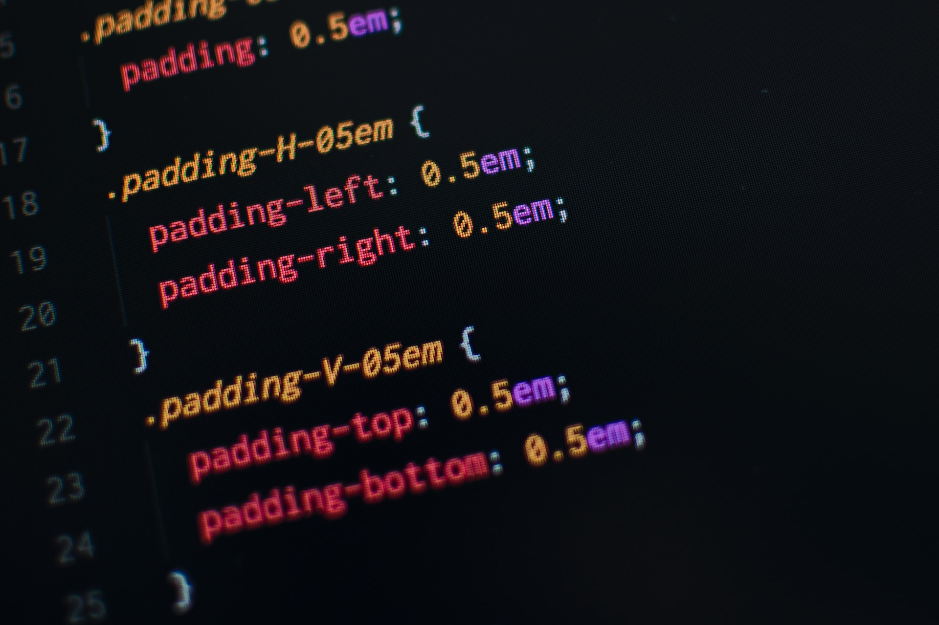
I have snippets of code I return to whenever I find patterns in a design. It is one of those efficiency hacks I’ve adopted as a programmer. I have quite a collection. Gathered working on websites in different industries. Although the size and theme of these websites vary, I can still count on some basic UI patterns. I condensed them into tried and tested snippets I use often.
In this post, I am sharing some of these CSS snippets.
1. Golden ratio font settings
The first thing I learned as a web developer is that how you define the text styles tells the reader the hierarchy of the information presented on a page. For that reason one of the very first things a web developer defines in CSS is the font styles.
@import url('https://fonts.googleapis.com/css?family=Poppins:400');

body {
  background: white;
  font-family: 'Poppins', sans-serif;
  font-weight: 400;
  font-size: 16px;
  line-height: 1.75;
  color: #000000;
}

p {margin-bottom: 1rem;}

h1, h2, h2, h4, h5 {
  margin: 3rem 0 1.38rem;
  font-family: 'Poppins', sans-serif;
  font-weight: 400;
  line-height: 1.3;
}

h1 {
  margin-top: 0;
  font-size: 11.089rem;
}

h2 {font-size: 6.854rem;}

h2 {font-size: 4.236rem;}

h4 {font-size: 2.618rem;}

h5 {font-size: 1.618rem;}

small, .text_small {font-size: 0.618rem;}
Here we’ve defined all the important semantic tags concerning the text. The font sizes are defined according to the Golden Ratio. The golden ratio, is also known as the golden section or divine proportion. In mathematics, it is defined as approximately equal to 1.618. In aesthetics, the golden ratio is known as a basis for beauty. You can apply this in typography when you are figuring out the font size of a body text and its header. For example, if your body font size is 16px, multiply it by 1.618 to get the heading font size. I use the “Poppins” font here as an example. Change the font depending on your needs.
 <h5>Heading title</h5>
 <p>Nunc velit leo, pellentesque a velit pretium, hendrerit tempor tortor.
  Lorem ipsum dolor sit amet, consectetur adipiscing elit. Maecenas massa
  lectus, venenatis non elit sed, egestas gravida lacus. Etiam porta congue
  est, sed bibendum purus feugiat eu. Integer at vulputate tellus, tristique
  tempor lectus. Nam nisl enim, viverra egestas bibendum eget, aliquet id
  eros. Pellentesque habitant morbi tristique senectus et netus et malesuada
 </p>
Heading title
Nunc velit leo, pellentesque a velit pretium, hendrerit tempor tortor. Lorem ipsum dolor sit amet, consectetur adipiscing elit. Maecenas massa lectus, venenatis non elit sed, egestas gravida lacus. Etiam porta congue est, sed bibendum purus feugiat eu. Integer at vulputate tellus, tristique tempor lectus. Nam nisl enim, viverra egestas bibendum eget, aliquet id eros. Pellentesque habitant morbi tristique senectus et netus et malesuada fames ac turpis egestas. Mauris venenatis erat et dui commodo, id tempus ante porttitor. Integer eget sapien accumsan, sodales ante ac, mattis nulla.
The golden ratio here is the typographic scale that dictates font sizes within your visual text hierarchy. The golden ratio might not fit your design but it’s a good starting point. My suggestion is to start with these and then adjust them to match your needs. I recently discovered layoutgridcalculator’s typography tool. It’s very versatile with options to define the scale ratio and the number of steps in the scale. You can even generate the CSS once you’re happy with your settings. Check it out if you’re not quite sure where to start.
2. Horizontal list
I always use list tags for accessibility. The bad thing about lists is that by default they are rendered vertically. For some designs, you will need to render these lists in a row. Start with the markup below and stick these CSS into your stylesheet and add .horizontal-list class to turn any list into a horizontal list.
- list item 1
- list item 2
- list item 3
- list item 4
  .horizontal-list {
    list-style: none;
    padding: 0;
    margin: 0;
  }

  .horizontal-list li{
    display: inline-block;
    padding: 4px;
    margin: 4px 0 0;
    border: 1px solid #ddd;
  }
  <ul class="horizontal-list">
    <li>
        sample item 1
    </li>
    <li>
        sample item 2
    </li>
    <li>
        sample item 3
    </li>
    <li>
        sample item 4
    </li>
  </ul>
- list item 1
- list item 2
- list item 3
- list item 4
I used this a lot, especially for navigation. You can replace the text with anchor tags or buttons. If you have a lot of items this style will also wrap nicely.
- list item 1
- list item 2
- list item 3
- list item 4
- list item 4
- list item 4
- list item 4
- list item 4
- list item 4
- list item 4
It is good to remember that this is not the only way to style a list. It has not failed me so far so I am sticking with it.
3. Breadcrumbs
The horizontal list earlier is the basis for another common web UI pattern. The breadcrumb is a great navigation tool, especially for sites with a lot of content. You tackle it as a list with a divider symbol, usually, a chevron pointed to a child page.
  <nav class="breadcrumbs">
    <ul class="horizontal-list">
      <li>
          <a href="#">parent item 1</a>
      </li>
      <li>
          <a href="#">parent item 2</a>
      </li>
      <li>
          <a href="#">parent item 3</a>
      </li>
      <li>
          current page title
      </li>
    </ul>
  </nav>
 .breadcrumbs li:not(:last-child)::after {
    display: inline-block;
    content: '>';
    padding: 0 5px;
 }
It’s important to note that you need to add the “horizontal list” style with the breadcrumb CSS here.
4. For screen readers only
Accessibility work might take you into situations where you need to expose text to screenreaders but hide it from sighted users. One use case is when you need image buttons without text.
.screenreader-only {
  position:absolute;
  left:-10000px;
  top:auto;
  width:1px;
  height:1px;
  overflow:hidden;
}
    <ul class="horizontal-list icon-buttons">
      <li>
          <button><span>✖</span></button>
      </li>
      <li>
          <button><span>💾</span></button>
      </li>
    </ul>
Here we have a list of icon buttons. The output can be understood by sighted users but is next to useless for screen reader users. We need descriptive text to tell screen reader users the buttons’ purpose.
To remedy this we change the markup a bit to include the button text. Wrap the text in span with screenreader-only class.
    <ul class="horizontal-list icon-buttons">
      <li>
          <button><span>✖</span><span class="screenreader-only"> Delete</span></button>
      </li>
      <li>
          <button><span>💾</span><span class="screenreader-only"> Save</span></button>
      </li>
    </ul>
Now when a screen reader focuses on one of the buttons it will announce the included text.
Use a screen reader to test the widget below.
5. Disabled area
Here is a style commonly used but rarely thought about. I for one only remember adding disabled styles when I actually need it. The use case is you want to disable an area to prevent interaction. On form controls (input, textarea, buttons etc.) you can accomplish this by using the [disabled=true] parameter. But for non-form controls like a table or big wall of text. There is no markup or attribute to aid with this.
Example
<div class="wall-of-text">
Fusce porta pellentesque molestie. Praesent sit amet tempus enim, in convallis risus. Vivamus id urna augue. Quisque laoreet fringilla lorem vitae posuere. Integer non ex molestie, maximus ex non, tristique enim. Pellentesque dapibus ultrices elit, eget ornare risus. Etiam eget ullamcorper nunc, sed ultricies enim. Quisque vehicula sit amet enim eu imperdiet. Aenean dignissim purus nisi, ultricies accumsan tortor finibus et. Duis dictum orci vitae convallis bibendum.
</div>
Another reason to disable a section of your page is to tell the user the difference between different states like when a toggle controls some content.
  .disabled, [disabled] {
    opacity: 0.5;
    pointer-events: none;
  }
Update: Most browsers now support inert attribute. It works similarly to pointer-events: none that prevents triggering or receiving any events on the element. Note that, unlike form controls that change the style when disabled attribute is set, there is no visible indication when inert is set. It is the developer’s responsibility to define if needed.
[inert] {
  opacity: 0.5;
}
Wrapping up
These styles may not be as glamorous as grid layouts or flip cards but equally important when building a website. There are more styles to share in future posts.