Build an Accessible Tab Container
October 10, 2022
web-developmentaccessibilitybest-practiceAs part of the work I do for my employer, I analyze UI elements on our product to check if we need to re-engineer the component to improve accessibility. One of the accessibility challenges I have reworked for our company site is the tabbed container.
Imagine a folder with pages you can flip through using tabs at the edges. That is the closest I can imagine when I think of tabbed containers. This concept is very straightforward, tabs on top of the container serves as buttons to access the corresponding grouped content. Only one grouped content is shown at any time. I love tabbed containers because they are very good at cleaning up the interface when you have so much content but have the same level of importance.
For the new component, I based it on the tab panel pattern suggested in the WAI(Web Accessibility Initiative) site.
Focus Order
Using the keyboard with the old tabbed container, the focus goes from the first tab, 2nd tab, 3rd tab, and so on. Then the tab content 1, etc. One would need to finish traversing the tabs before you can access the first tab’s content. Its confusing to screenreader users as you would assume when you focus on the tab you can read the content.
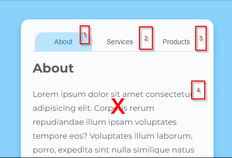
The navigation sequence does not follow the natural way of content consumption.
To improve the focus/read order, we should make the first tab active and prevent the inactive tabs from getting the focus sequence. Navigation will go directly to the content when tabbing from the tab button. Another rule some UI developers forget is to make sure hidden elements do not get focus. So for the previous example, the “Services” and “Products” content panels and its content must not receive focus.
Now the user is only able to access the currently active tab and tab content
.Keyboard controls
The old tab container component only supported the Tab key to navigate which only follows the DOM sequence. A few tabs are tolerable but once you get more than five(5) tabs it can be annoying for the user to use.
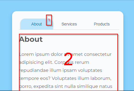
To make the component keyboard accessible, we add behavior that follows the WAI tab panel pattern. The tab navigation activates once the focus goes to the active tab (button). Using the Arrow Left and Arrow Right, the user can navigate to the previous and next tabs correspondingly.
Additionally, you have two types of tab container behavior. Automatic tab containers will switch to a new tab when focus changes. While, Manual tabbed containers use Enter or Spacebar key to confirm the switch. I will use the “automatic” behavior for our demo.
The active tab shows focused styling when navigating with the keyboard. Using the arrow keys we can navigate to other tabs.
ARIA attributes
Accessible Rich Internet Applications (ARIA) is a set of roles and attributes that define ways to make web content and web applications (especially those developed with JavaScript) more accessible to people with disabilities.
It would have been nice if there was a tab panel semantic tag. There is none so we use ARIA attributes. On their own ARIA attributes do not do much. It does not add styling or extra behavior. But for screen readers or tools that aid people with impairments, ARIA attributes paint a picture that a browser can interpret.
For the tabbed container, we set the following ARIA attributes.
| ARIA attribute/role | Description |
|---|---|
| role=tablist | Container for tab buttons |
| role=tab | Tab button element. Contains the label for the currently active content. |
| role=tabpanel | Container for the currently active tab content |
| aria-selected=true | Tab button is selected and content is visible |
| aria-selected=false | Tab button is inactive and content is hidden |
| tabindex=-1 | Removes the element from tab order sequence. We use this for the inactive tabs and hidden tab content. Aids in focus management. |
| aria-controls=ID | Set on the tab button. ID refers to the associated tab content |
| aria-labelledby=ID | Set on the tab content container. Refers to the tab button serving as a label for the content. |
| tabindex=0 | Set on the tab content container. Puts the container back to tab sequence |