Typographic Hierarchy Playground
· 2 min read
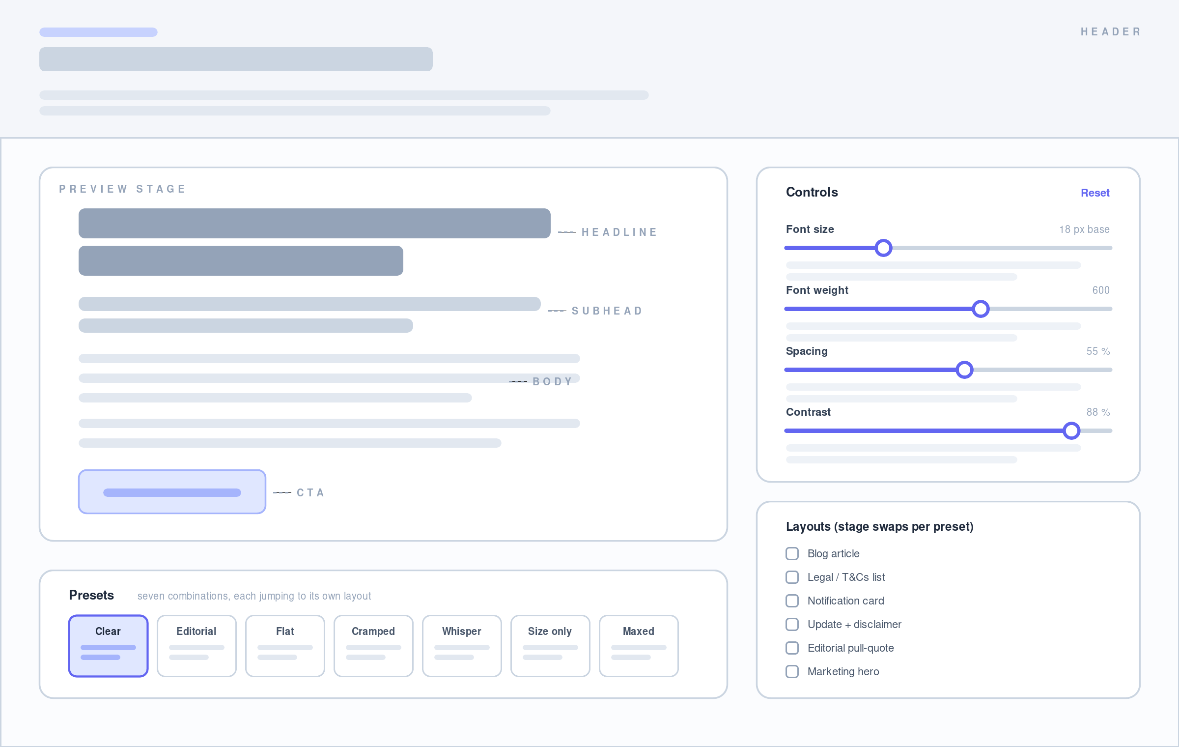
Drag four sliders and watch where your eye lands first.
Visual hierarchy has many levers — layout, color, imagery, motion. This demo isolates the typographic ones. Four sliders control font size, weight, spacing, and contrast; a live preview stage re-renders on every change, so the effect of each lever is visible rather than described.
Every value derives from one base. The headline is a multiple of the body size, subhead and CTA weights are offsets from the headline weight, and the spacing slider drives line-height, block gaps, and button padding together. Pushing a slider doesn’t just scale one thing — it widens or narrows the gap between elements, which is what hierarchy actually is.
Presets
Each preset jumps to the layout it belongs to and explains what it’s demonstrating:
- Clear Hierarchy — every lever pulls the same direction; one obvious reading path.
- Editorial — the restrained middle ground most documentation sites converge on.
- Flat Hierarchy — nearly uniform blocks. No entry point, so the eye searches. Correct for legal text, wrong for an article.
- Bold & Cramped — weight still leads, but near-zero spacing collapses the structure.
- Low-Contrast Whisper — decent hierarchy hiding a contrast failure. It’s labeled as a mistake: at that setting the body copy fails WCAG AA and reads closer to invisible than subtle.
- Size Only — weight and contrast left neutral. It works, but less confidently.
- Everything Maxed — every lever at its ceiling. Nothing is emphasized once everything shouts.
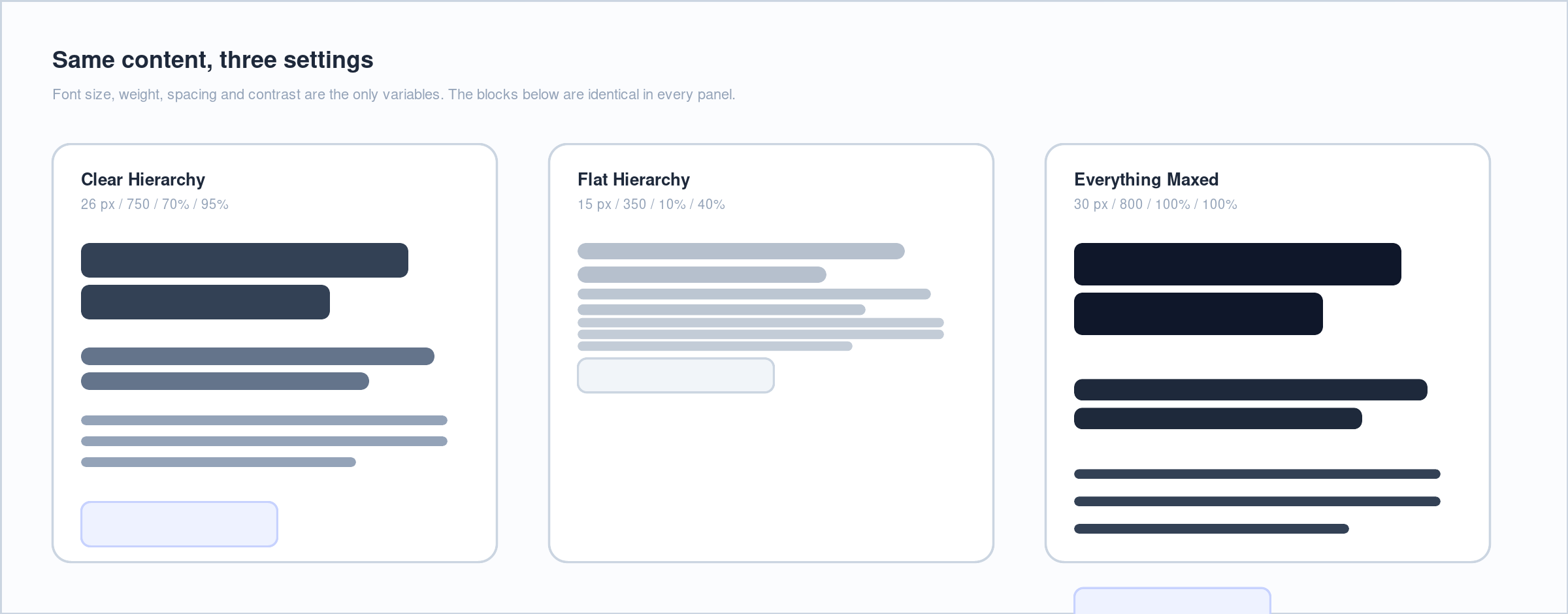
The point of the “bad” presets is that most of them aren’t bad — they’re mismatched. Flat hierarchy is the right answer for a spec sheet and the wrong one for a blog post. Only the low-contrast preset is unambiguously broken, and it’s marked as such.
Layouts changes with Presets
A single article layout would only prove that big headlines beat small ones. Instead the stage swaps between six scenes, each one a place the setting in question actually shows up in production:
- Blog article — headline, subhead, body, CTA
- Legal / T&Cs list — dense reference text with no single entry point
- Notification card — a heavy label winning attention in a tiny footprint
- Product update with disclaimer and timestamp — deliberately de-emphasized metadata
- Editorial pull-quote — large, light type as its own device
- Marketing hero — eyebrow, headline, subhead, dual CTAs
Notes
Contrast is the one lever doing two jobs: it pulls the eye and keeps text legible. That’s why it’s the only slider whose extreme is called out as an accessibility failure rather than a stylistic choice — the same setting that makes a disclaimer feel appropriately quiet, pushed a little further, makes it unreadable on a phone in sunlight.
Built with React and Vite, styled with Tailwind, deployed to GitHub Pages on push to main via GitHub Actions.
Final screen
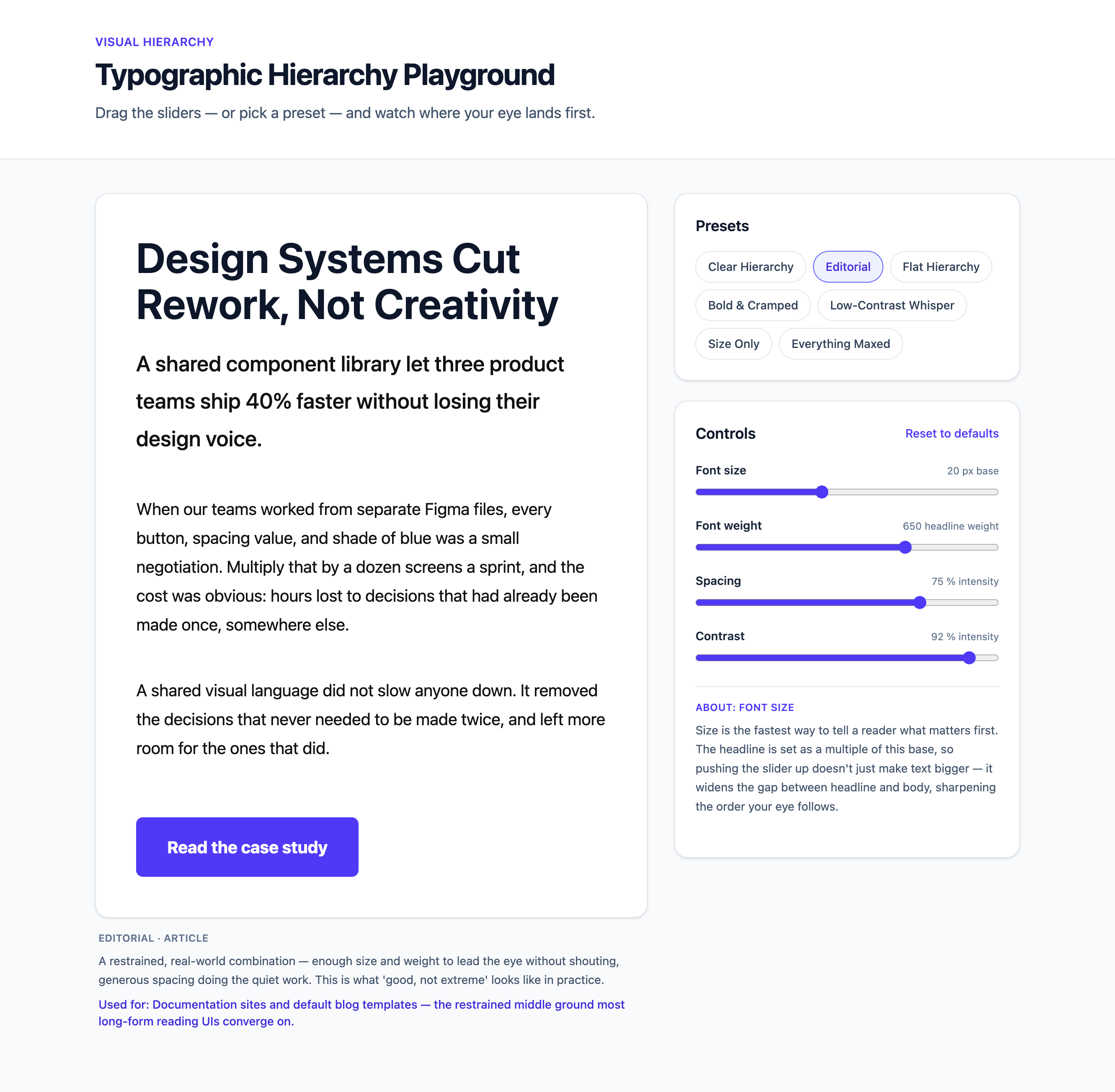
Here’s the final output. Previous iterations had was text heavy - made the page too busy. The preview screen should be the star. Now we only disclose the information you need for the current state. The levers show explanations on hover or focus.
Links