Mobile Pet Gallery
· 1 min read
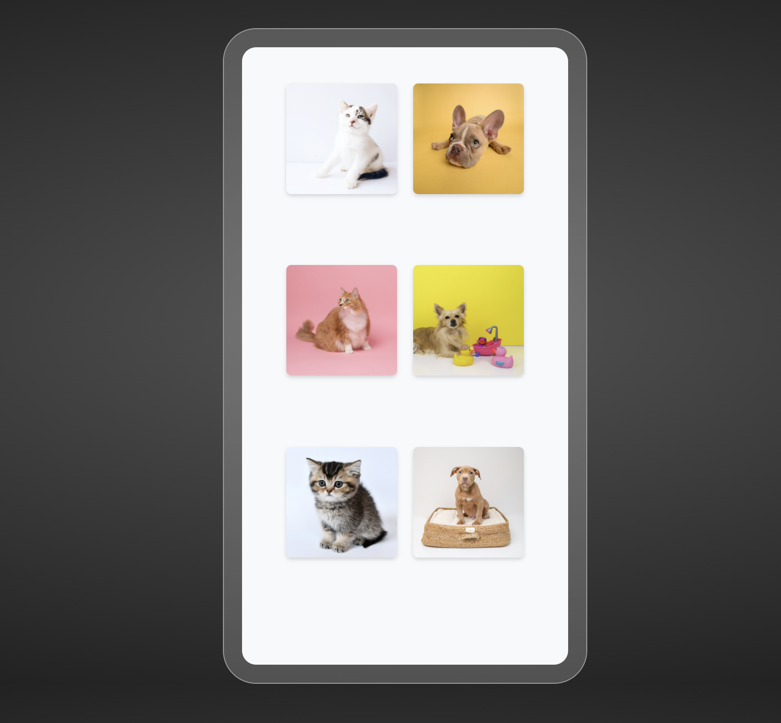
A CodePen challenge entry: a pet adoption gallery sized to a phone, with two views — a thumbnail grid and a full-bleed carousel — and a transition between them that runs on CSS alone.
The experiment
The question was how much of a layout change CSS transitions can absorb before you need JavaScript to animate it. The answer: more than expected, as long as you transition the container rather than the items.
The two views are one DOM tree. A hidden checkbox holds the mode, and the sibling combinator (.mode:checked ~ .gallery) swaps the gallery between a wrapped flex grid of 110px thumbnails and a single-row flex track of 360px slides. The transition list on .gallery — left, width, height — plus width on each figure means the browser tweens the reflow. Clicking a thumbnail unchecks the box and slides the track to that index; the home button re-checks it and returns to zero.
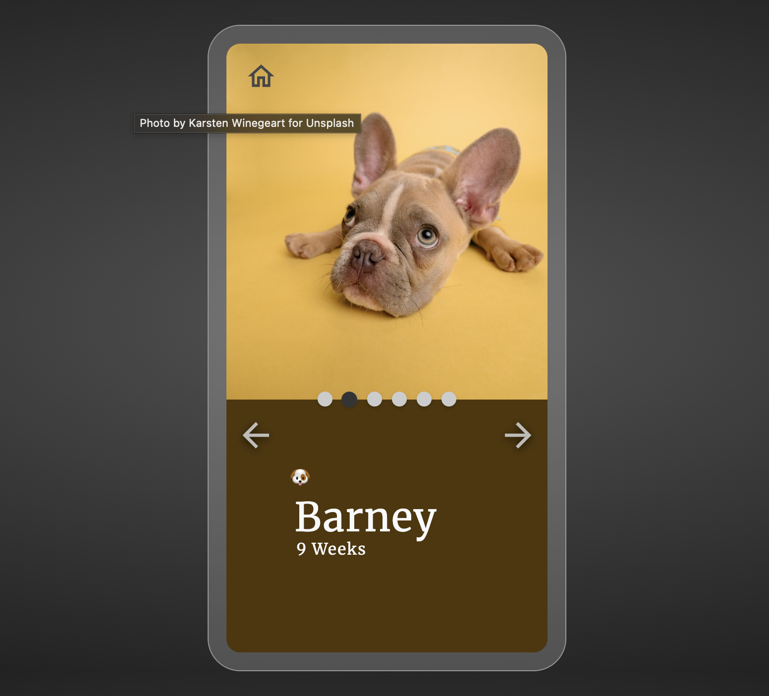
Paging is the same trick applied to a smaller element. Six dots sit behind a single dark “follow” dot, positioned by .active:nth-child(n) ~ .follow rules and transitioned on left, so the indicator glides to the current page instead of the page repainting. A short scale keyframe fires on arrival, restarted by the usual clear-animation/force-reflow/restore dance since animations don’t replay on their own.
JavaScript does the bookkeeping only: track the index, set gallery.style.left, toggle the active dot, hide the arrow at either end. Every visible movement is a transition.
Notes
Transitioning left and width means animating on layout properties, which is the expensive path. At six slides in a 360px frame it’s fine; a longer gallery would want transform: translateX() instead. The checkbox-as-state-holder is doing real work here, but it’s a hack — the mode toggle isn’t announced to assistive tech, and swipe/drag handling never got built.
Links
- Pen on CodePen
- Photos from Unsplash, hosted on CodePen assets