
Using Container Queries to Make a News Layout
February 24, 2023
csslayoutfrontendWhen I hear media query I think about a bottle filled with liquids that don’t mix (e.g. oil and water). The content(water/oil) will assume the shape and size of the container (bottle). I will not bore you with “science-sy” stuff but some predetermined properties of these liquids define how they exist inside the bottle. Oil is lighter than water so it floats etc. But ultimately they are governed by their single container. You can’t make the oil shaped as a globe float inside of the region of water occupies. What if you have a glass sphere to contain the oil? Then made it so it is suspended inside the bottle? That is what container queries do for CSS. Container queries become the smaller glass container inside the bottle. Then your content can then follow the rules of that smaller container instead of depending on the rules of one bottle. This will allow you more flexibility in styling layouts.
Container queries enable you to apply styles to an element based on the size of the element’s container. If, for example, a container has less space available in the surrounding context, you can hide certain elements or use smaller fonts.
For years, developers like me have asked for a better way of styling website elements, especially on where or how they are contained in a site. Media queries have their uses but they don’t help much if you want to make reusable independent components. Media queries are better suited for setting up page layouts. The dream is to have a UI element - drop it anywhere on the site and it reconfigures itself based on where and how the container is configured. Because you are using the container dimensions and not the viewport you can more accurately bake in the styling of a reusable element based on what available space the parent element has and not how wide the browser viewport is showing. Imagine the glass sphere in the bottle analogy earlier. Oil is the UI element and the glass sphere is the parent container. The UI element will not care how the rest of the page is configured. Only on how its parent is configured. To achieve this in the past developers resorted to JavaScript. You know how I hate adding more scripts to a page. Sometimes the convenience does not justify the added library size.
This is where container queries come in. They are the solution we’ve been asking for all along.
Some technical explanations and code patterns in this post are based on the MDN documentation on CSS Container Queries.
How to do container queries
There are two steps to doing container queries.
- Make a wrapper element and setup
containerproperty - Define styles in container query
1. Make a wrapper element and setup container property
To start using container queries, we first define a container or wrapper element with a container type.
.section-container {
  container: my-container / inline-size;
}
In the CSS above, we are using the shorthand way of defining a container. The first value is the name we want to identify the container query the second value is the container type. It is equivalent to the CSS below.
.section-container {
  container-name: my-container;
  container-type: inline-size;
}
2. Define styles in container query
A container query is similar to that a media query.
@container my-container (min-width: 800px) {
  // style here
}
These are the very minimum things you need to learn to use container queries. There are other things to know container units - I will leave that for a later post.
The experiment
To understand container queries better I did made an experiment. My idea was to create a news layout where the content is a bunch of cards with the same markup and content. Depending on how the container is configured the news cards will show in different ways.
I made a wireframe with the following:
- Full-width hero card on top
- A medium-sized news card
- A news list with multiple content
- A grid with multiple contents
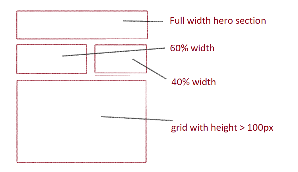
I’ve configured the cards in the wireframe to show in different styles. For the full-width top section “stage”, I want the card to show as a hero element. In the medium “stage”, the card would look like a wide news card. With the news list stage, I placed multiple cards that will show as a text list with no images. In the final grid “stage”, I wanted to show a news grid with multiple cards.
Also not to forget, on smaller screens(e.g. mobile) all the cards will show as one column card grid.
Remember that all these cards have the same markup. Imagine you have a server-side rendered(SSR) endpoint that returns an array of cards with similar markup sorted by descending date(e.g news post). Then you just drop all this content in different containers until you fill the layout. No need to cherry pick the data and render to different locations.
Check the pen here for a demo.
What I learned
Doing the experiment I learned a few things. It is easy to start using container query after you get through the initial confusion in learning to think in containers. Once you get used to thinking in container queries you’ll be amazed. I was thinking it would be great if we had this a decade ago when we were building our layout editor.😀
You are not limited to querying width. If we use container-type: size we can use the container height when defining a container query block. Using height opens up more possibilities when doing layouts. For example, I made the news list text wall by using the height of the container to tell the news card to only render the text and hide the images. In some way, I made my news cards smarter. Before the container query era, I had to do some complicated CSS class combinations to achieve the same thing or worse yet use JavaScript.
.stage {
  container-name: stage;
  container-type: size;
}

@container stage (width > 768px) and (height = 1000px) {
  .card {
    width: calc(100% / 3);
  }
}
Wrapping up
Container queries are another great tool in a web developer’s toolbelt. I would recommend spending some time learning the basics and how it interacts with layout-specific CSS like flexbox and grids. I would also suggest spending time learning the differences between container types and how to use container units.
Cheers!